First we have KAMA Studios
This initially went through two designs, the first was more colorful and the second was more darker


we settled with the darker design as we felt the first was too vibrant and colorful
Next we have DISTORTION FILMS
This like KAMA went through multiple design phases
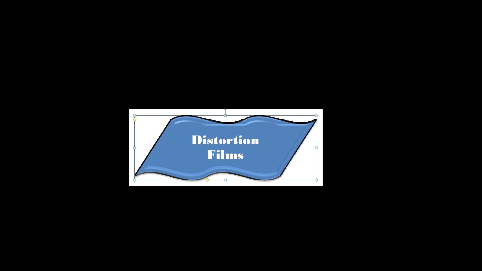
This first design was just a draft to see where I wanted to go with it. I wanted the design to be distorted like the text

I then liked the idea of lines going through the text to make it harder to read
finally while in Photoshop I made...

No comments:
Post a Comment